
You are currently browsing the tag archive for the ‘crucifixion’ tag.

It is Good Friday, and as per tradition, here is an exquisite crucifixion artwork to mark the occasion. The beautifully engraved print is remarkable for its enormous quality, precision, and detail: just look at the lightning striking Jerusalem in the distant background! However it is also remarkable for the two (or three) levels of reality which the artists/printmakers have divided it into. In the central rectangle, Jesus is crucified on a hill in Israel as Mary, Mary Magdalen, and Saint John lament. Moving outwards by a degree, we find a second, rather more metaphorical frame which presents the instruments of the passion: the cross, the scourge, the nails, the pitcher of vinegar. Only as we examine the carefully engraved items in depth do we discover how allegorical these images really are. The coins are avarice. The flail is cruelty. The cock is denial. The vinegar is bitterness. The sepulcher is fear. These bedrock emotional drives are the true tools of the Passion. It is by means of the universal nature of humankind that Jesus was slain, but only by transcending such things and moving inwards to a more divine and transcendent level of faith, tenderness, and compassion can we be redeemed.
Of course there is an unspoken third level as well–of bare paper which has not been pressed by the plate. This reminds us that we are looking at a little nesting universe of profound ideas which are the contrivance of gifted artists working in the real world with ink, burins, presses, and paper in order to make us think more carefully about existence…or such would be the case if you were looking at this in a Duke’s library or the Cooper Hewitt Museum. Instead you are looking at this on the internet on glowing pixels on my blog–so there is really a fourth meta-level of ideological interpretation (conveniently provided by me, some random guy on the internet just writing stuff). The 16th century was an age when thrilling new media lead humankind to terrible excesses (there is a reason all of those torture implements look so realistic). Theologians, political leaders, and rabble-rousers used these new tools to whip up the sectarian passions of Christ’s followers and drive the faithful to slay the faithful in vast religious wars. There is a symbolic reason the scimitar, the torturer’s tongs, and the open crypt are closer to the viewer than Christ is: God is separated from us not just by space and time, but by supernatural and moral hierarchy as well (and by ethnicity too, as the Hebrew at the top reminds us). I wonder if His followers in the modern era will see what the Christian artists of the new mass media arts of the 16th century were trying so hard to explain…

I failed to post a beautiful crucifixion painting for Good Friday this year…but don’t worry, I haven’t forgotten about the tradition, and I was thinking about the right painting over Easter weekend. Here is Crucifixion Diptych, a late work by Rogier van der Weyden which shows Saint John and Mary on the left panel lamenting Christ’s death which takes place on the right panel. Although the figures are beautifully painted, the colors and composition are unusually stark and the background elements–Golgotha, a stone wall, the night sky–are flattened and simplified. The painting does not suffer from this, but rather the jagged abstract shapes of vivid white, red, and green make it pop out among the other works of its era. I saw it back in the 1980s before a “reverse restoration” returned the sky to night blue (a restoration artist of the 1940s decided the sky should be gold), but even with the colors wrong it demanded attention. The work was painted in 1460, a few years before van der Weyden’s death and the profound stillness of the figures has led some art historians to speculate it was his last painting. Van der Weyden’s son joined the Carthusian monastery (which received gifts of cash and devotional paintings from van der Weyden), and it is possible that the red and white painting may also have been a private Carthusian devotional piece.
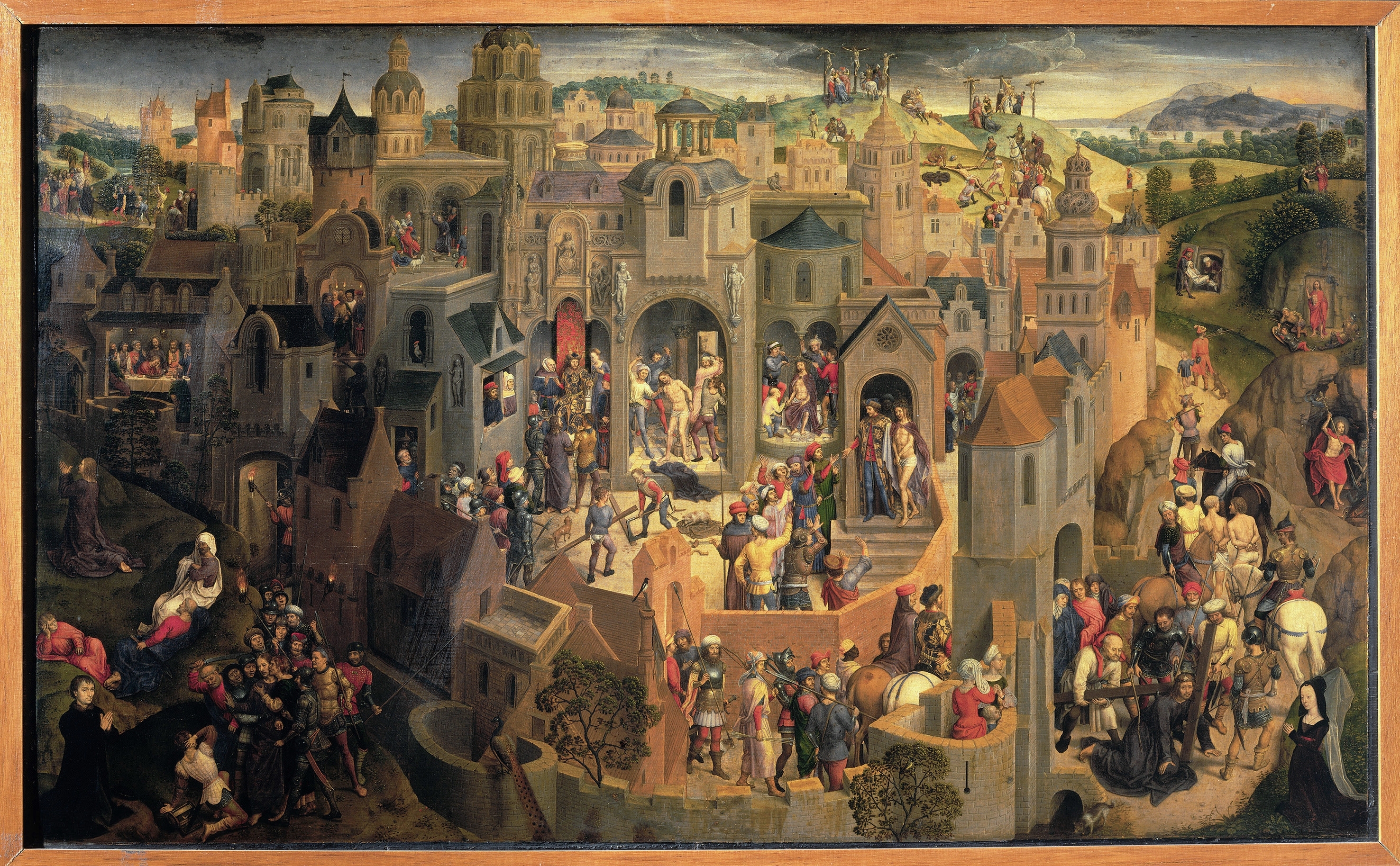 This amazing painting is by Hans Memling a Netherlandish master of German birth who worked in Bruges during the late 15th century. Memling painted the work around 1470 AD for a Florentine banker based in Bruges (that’s the banker’s donor portrait down there in the lower left corner). The painting is most important for illustrating that extremely rich financiers can commision whatever sort of work they like from gifted middle aged painters in their hometown, be it medieval Bruges or, say, contemporary Brooklyn, however, the painting is also astonishingly a still painting with modality: like a sort of 15th century movie. Instead of telling one scene from the passion of Christ, the painting tells many stories from the death and resurrection of Jesus in the same larger scene. By moving around the painting and “reading” it, the whole story becomes evident (I especially like how ancient Jerusalem looks like a slightly exoticized version of Bruges). Since WordPress hates art, you can only blow it up to a certain size here, but it is well worth going to Wikipedia and looking at a larger version where you can pore over the exquisite details of Memling’s craft (and contemplate the meaning of Jesus’ ministry and his execution). For such an intricate work, the original is rather small–less than a meter wide. Memling excelled at painting complex pictures of entire cities like this, yet despite the ornament and pageantry, the real focus never leaves Jesus as he is hailed and then denounced by the mob, judged by politicians, tortured and executed, and finally risen as a deity. Despite its intricacy and scope this is a rather human and intimate work. Memling seems to have known the fickle back-and-forth of society, so one can find all sorts of reticent retainers, devout followers, haughty lords, and confounded strangers in this work. It is a reminder that the the antagonist, and the supporting characters, and even the setting of the passion are humankind–the story is meant to represent all of us. Even Jesus, the son of man, is human until the last instance when he is revealed with his halo and scarlet robes of godhood.


I promised a beautiful painting of Jesus for Easter and here is one of my favorite altarpieces from the Met. This wonderful painting is “The Crucifixion with Saints and a Donor.” It was largely painted by Joos Van Cleve (with some assistance from an unknown collaborator) and was finished around 1520. The painting is very lovely to look at! Joos Van Cleve endowed each of the saints with radiant fashionable beauty and energy. From left to right, we see John the Baptist with his lamb and coarse robe; Saint Catherine with her sinister wheel (yet looking splendid in silk brocade and perfect makeup); Mary is leftmost on the main panel in royal blue; Saint Paul holds the cross and touches the head of the donor (whose money made all of this possible); and Saint John wears vermilion garb and has a book in a pouch as he gesticulates about theology. On the right panel are two Italian saints, Anthony of Padua and Nicholas of Tolentino. Probably this altarpiece was an Italian commission or maybe the Flemish donor had business or family connections in Italy.
But van Cleve’s delightful saints are only half of the picture. In the background, the unknown collaborator has painted a magnificently picturesqe landscape of cold blue and lush green. Fabulous medieval towns come to life amidst prosperous farmlands. Rivers snake past forboding fortresses and great ports. The distant mountains become more fantastical and more blue till they almost seem like surreal abstraction in the distance. You should blow up the picture and let your spirit wander through this landscape (I think WordPress has discontinued that feature in a bid to frustrate users, however you can go the Met’s website and zoom into the painting and step directly back into 16th century northern Europe).

Somewhat lost in this pageant of visual wonders is, you know, Jesus. The painting’s lines don’t even really point to him. He suffers on his cross in emaciated, gray-faced anguish, forgotten by the richly robed saints and the wealthy burghers of the low country. Only the Virgin seems particularly anxious. Yet, though Van Cleve has de-emphasized the savior within the composition, he has painted Christ with rare grace and feeling. The viewer can get lost in the landscape (or looking at Catherine’s lovely face) but then, as we are craning our neck to see around the cross, the presence of a nailed foot reminds us this is a scene of horror and divinity. I have spent a long time looking at this painting and I found the the juxtaposition of wealth, industry, fashion, and riches, with the overlooked figure of Jesus naked and suffering to be quite striking. It is a reminder to re-examine the story of Jesus again against the context of more familiar surroundings. I am certainly no Christian (not anymore) but it seems like there might even be a lesson here for America’s ever-so-pious evangelicals. With all of the excitement of wealth and political power and 24 hour Fox news and mean supreme court justices and billionaire golfers and super models and what not, I wonder if there is anyone they are maybe forgetting…

Icon of the Crucifixion (Andrea Pavias, second half of 15th century, egg tempera and gold on wood)
This blog traditionally presents a beautiful crucifixion painting for Good Friday. This year’s selection comes from a somewhat different artistic tradition than the paintings of previous years. This is Andreas Pavias’s Icon of the Crucifixion, a Greek icon painted in the style of Byzantine art. The beautiful and troubling image was created at the end of the 15th century, in the years following the fall of Constantinople. After more than a thousand years, the Byzantine Empire had finally died, yet for a while longer, in Greece and in the Slavic near east, the Byzantine artistic tradition lived on and had a final glorious flowering. This crucifixion is not about realism in the same way as works by Durer and Mantegna (who were painting at the same time). The action takes place in an otherworldly golden space filled with stylized angels. The Romans soldiers have been replaced by Turks. The holy family and the saints and disciples are all dressed as Byzantine nobles. Each group of figures enacts a drama from the passion: yet the action has the stylistic quality of an elaborate didactic illustration (or even a modern pictographic work of media—like a video game) rather than the sumptuous realism of Renaissance Italy. Yet the work is no less magnificent because of this quality. Indeed the seething angular forms give it an alien intensity well suited to the subject.
Cast your eyes around the icon and take in the details! The sun and moon have shrunk to little gold faces the same size as the countenances of the angels which fill the sky. Turkish executioners are breaking the legs of the two robbers to either side of Jesus—an act of “mercy” which allowed the brigands to die more swiftly. Yet Christ continues to suffer on, nailed to the monumental jet black cross dripping with blood. On the left, little resurrected figures awaken from Golgotha to eternal life. On the right, the profane throw dice for Jesus’ divine raiment. Between them, a fissure opens up at the foot of the cross. It snakes down into the black depths of hell where writhing demons wait.

Crucifixion (Andrea Mantegna, ca. 1460, tempera on panel)
Here is Andrea Mantegna’s exquisite tempera masterpiece showing the crucifixion of Jesus. I am going to present it without much comment except to note that it is a high-resolution file so you can (and should!) click on it to see a larger version. By doing so you will be sucked into the disturbing, beautiful 15th century world of Mantegna where everything and everyone seems to be carved of some aristocratic stone (quarried perhaps from the Golgotha they stand upon). Tempera paint gives an artist the ability to paint with disquieting hyper-realism, but it takes away some of the velvety shadows and lifelike glow which have made oil paint the preferred medium for western art for six centuries. In the hands of an all-time master like Mantegna tempera’s strengths and limitations creates an unearthly effect fully appropriate for the death of the savior.

The Madonna of the Passion (Carlo Crivelli, 1460, tempera on panel)
Just in time for the holidays, here’s another “Madonna and Child” painting by Carlos Crivelli, the enigmatic Quattrocento master. Ferrebeekeeper has already featured two posts about Crivelli including a short biography (which includes just about everything we know about him) and an exquisite painting of Mary Magdalene. Today we present another Crivelli tempera masterpiece from 1460 which shows Mary holding a pensive baby Jesus as creepy little foreshadowing figures gather round. Although Mary is not without a certain supercilious beauty, the two central figures are not nearly as fine as in other Crivelli masterpieces. Standing on his little black velvet pillow like a demagogue orator, Jesus looks downright horrifying (and he also seems suitably appalled at knowing his own fate). The great strength of the painting lies in the supporting cast of corpulent androgynous children brandishing accoutrements of the crucifixion. The little beings to the right solemnly proffer a crown of thorns and a cross to infant Jesus. On the left, one child (wearing tiger skin grieves!) holds a fistful of crucifixion nails while his naked playmate grasps a classical column with spidery hands. Behind him are children with a lance, a bucket of vinegar, and a ladder. The little lanceman on the left is staring up at an allegorical rooster standing atop capitol. In the background, on the right, the death of Christ takes place on a distant hill, while at the top, beyond a garland of peaches, pears, cherries, and songbirds, a final pair of putti play divine music on the harp and lute. The suffusion of tiny black pits or holes in the composition was probably not intended by Crivelli (although he did have a fascination with nail wounds), but it adds an extra dimension of entropy, torment, and decay to an already vexing painting. Once again Crivelli deftly takes traditional religious elements of the passion and arranges them into an allegory which seems to subtly elude the comprehension of the viewer. Is that Peter’s rooster or is it some lost symbol of 15th century Italy? Are the childish beings with the implements of Christ’s death a vision of the anguished Christ child, or are they meant to represent us, the viewer, tormentors and torturers of the world who, like ignorant children, don’t even understand what we are doing?

The Crucifixion (Rogier Van der Weyden, ca. 1445, oil on panel)
Probably the most common theme of Gothic painting was the crucifixion of Christ, an event which was central to the universe-view of nearly all Europeans of the late Middle Ages and early Renaissance. To observe Good Friday, here is a triptych of the Crucifixion painted by one of my favorite Flemish painters, Rogier Van der Weyden (1399 or 1400 – 1464). The painting was probably completed around 1445 and can today be found in the Kunsthistorisches Museum in Vienna.
Very little is known concerning Van der Weyden’s life and training. We know that he was an international success and rose to the position (created expressly for him) of official painter of Brussels–then the location of the renowned court of the Dukes of Burgundy. But aside from that, only tidbits are known about a man who was probably the most influential and gifted Northern European painter of the 15th century.

Detail of Right Panel
Van der Weyden painted from models, and this crucifixion demonstrates a very compelling realism. The grief and incredulity of the mourners is conveyed in their vivid expressions and poses. The magnificent color and beauty of their garb underlines the importance of the spectacle. Behind the figures is a huge empty landscape which runs continuously through all three panels. The left wing shows a medieval castle, but the other two panels present a strange idealized Jerusalem.
Mary Magdalene is the lone figure of the left panel and St. Veronica is similarly isolated on the right panel. In the middle, John the Apostle tries to comfort a distraught Mary who is grabbing the foot of the cross as her son dies. To the right of the cross are the wealthy donors who paid Van der Weyden for painting the picture. To quote Bruce Johnson’s Van der Weyden webpage, “The donors, a married couple, have approached the Cross; they are shown on the same scale as the saints, though they are not to be seen as really part of the Crucifixion scene – they are present only in thought, in their prayer and meditation, and are thus on a different plane of reality from the other figures.”

Detail of Mary Magdalen
The greatest glory of the painting is its nuanced palette. The magnificent vermilion and ultramarine robes leap out of the muted green landscapes. Van der Weyden was renowned for using many different colors. Art historians have averred that even the white tones in his greatest compositions are all subtly different. Color also lends an otherworldly numinous quality to the dark angels hovering unseen on indigo wings as the execution takes place.
